the challenge
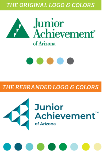
Junior Achievement (we like to call them JA for short) underwent a large rebrand, culminating in a new logo, as well as an updated color palette and typography.
JA of Arizona was looking to transition its local chapter’s visual identity to match the new look and feel of the larger JA organization.
our approach
Update Assets The new logo represents the impact that begins with 1 changemaker who prepares students to succeed with a focus on 3 sets of life skills. This impact extends to many!
Engage Local Audience Biztown Interior Rebrand & Outdoor Rebrand Recommendations
Amplify Presence Event Tabling, Banners, and T-Shirts
Create Collateral Suite of Event Brochures & Email Template
the happy-ever-after
Junior Achievement stakeholders, including students, educators, donors, sponsors, and employees will now have a consistent brand experience across multiple touchpoints. When it comes to marketing, a consistent brand is a strong brand!
